Monday 29 June 2015

EXP 3: Additional Images and Information

Square House additions


View of the School after walking under the Block House


View of the Square house additions from the approach to the entrance


Entrance Stairwell to the main lobby


At the top of the entrance stairs and looking into the lobby


A view of the lobby from the refurbished Square house balcony side of the space. With the exit on the left, and the lecture theater on the right. This image shows the three main textures of this side of the building with the original bricks of the square house, the grey metallic texture, the red rusted cor - ten steel texture, as well as the custom scalar texture. My using a combination of these textures in the various rooms of the Square house additions, there is a sense of rigidity, formality, and discipline. This environments characteristics are designed to reflect the more formal methods of education, as well as administration, that are housed within this side of the school.


View of the workshop and view of the Lobby from the sitars


Lobby from the workshop stairs


Corridor from the Lobby and towards the offices. this corridor has access to bathrooms on the right, while the scalar texture feature here at a smaller scale, indicating the scalar change of space of this form.


The additions from Anzac Parade, showings the change of angles while retaining the same basic form between each section of the building, following the idea from the mashup of using a natural form motif and applying them to different contexts


One of the office spaces for senior academic staff. there are another three of these offices in this section of the building


Meeting space for the academic staff


The northern side of the building. contains the Deans office, general staff offices,general staff meeting area, junior academic staff offices as well as the research rooms.


The Deans office


General office , on the right access to the senior academic staff offices, on the left stairs down to the junior academic staff offices and research space, as well as exit from this section of the building


General Staff meeting room


Walkway in the building leading out on the Square house balconies. the room on the right is the junior academic staff office


Research space for the academic staff


the northern end of the Square house balcony at eye level


High angle view of the northern end of the Square House balcony, on the left is the bridge that extends to the other half of the school


The southern end of the Square house balcony, with the entrance to the lobby 

Bridge


Entrance to the Bridge


Interior of the bridge with the linear texture on both the ceiling and floor, to enhance the sense of direction. The window slits on the sides of the bridge, increase in size and regularity, creating a sense of growing lightness as people travel towards the other half of the school. This is used to reflect the bridges purpose as an intermediary device between the two halves of the school. With the side connected to the Square house starting off darker reflecting the formality and rigidness of the school on this side in both form and purpose, and slowly increasing in lightness to the Roundhouse side of the school, which is more focused on interactive and less formal means of learning, which is represented in its more curvilinear form as opposed to the rigid and angular lines of the Square house additions

Round House additions


View of the first floor of the Roundhouse additions. The elevating platform is on the right, library to the far left. student meeting rooms to the distance, and the student study space in the middle .


Interior of the student meeting rooms. There are 4 meeting rooms in total providing a capacity for 36 students. These rooms may also be used for small tutorial groups with 8 or less people


View of the first floor of the roundhouse additions, from the library end of the building. light is able to enter freely through the glass exterior walls. The color palette is also well reflected in this image. Using these more neutral colors a nonchalant mood is reflected, following in terms of the teaching style upheld by this side of the school


View of one of the first floors traditional  tutorial rooms. There are two of these traditional styled tutorial rooms, with a combined total capacity for 60 students


View of the second floor from the first floors stairwell. 


One of the second floors Active Learning style tutorial rooms. with sitting for students arranged in groups of eight. This room provides a capacity for 40 students. From the image above it can also be seen that the walls of this space don't go all the way up to the white ceiling. instead they are capped with a glass roof. This ensures that they are more sound proof, but still allow the vast amounts of natural light in this room, and through to other spaces of the building


Above is another Active Learning style tutorial room from the second floor. But this one provides a lower capacity of  24 for smaller tutorial groups.


The space above is another tutorial room, this one is modeled after a case study styled tutorial room. This room provides a capacity for 58 students. The glass roof for the shorter walls can be seen here, with the surrounding space also visible. 


The space here is one of the two computer labs. these two rooms are found on the top floor of the roundhouse additions.  The combined capacity of these two rooms is 84


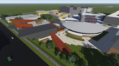
This bird eye view of the roundhouse and the school sitting atop, shows how the triangular forms of the school from the natural form motif, have been used in a horizontal orientation and manipulated using inspiration from the natural phenomena of fractals, to create a form that reflects the roundhouse as a sight, creating a circular space that houses the less rigid forms of learning through  natural interactions. 

Experiment 3: Final Submission

Development:

Mashup

To him, a tree is a pure being of obsolete presence; in his simple terms: “Nothing special – incredibly powerful”- Peter Zumthor. Following this ideal, We can replicate the forms of nature and their feeling of presence, of space, of material, creating new organic  connections between the existing hierarchy. Through the inclusion of organic and natural forms as well as the incorporation of ’green architecture’, this new form will bring new green space to urban settings and relieve congestion and open up surface ground for new uses. Furthermore it creates a “living dictionary of the natural heritage” connecting the urban environment to its natural past. Through these concepts the urban setting is now about creating an atmosphere, and this is about creating architecture.

Mashup link
(Original sources can be found in the link above)


Sketches

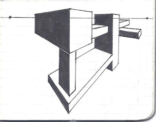
One point perspective sketches:

Below is the set of one point perspective sketches that i started with to work out the form of the new school

Connection between distinct forms


Imitation of the natural tree form


bridging between the vertical and horizontal axes


Two point perspective sketches:


Organic connection between forms


The monumentality of elevated mass


Branching off like a tree


Model Development

My model began with a modeling of the perspective drawings above. This then developed utilizing the plans given to us in the tutorial. The Zahar Hadid's proposed plan for the Irish Prime Minister's Residence was my given plan inspiration, this started with my plan, elevation and 3D drawings and then into a model. This model was then refocused, taking more account of the site i.e. the square house  and the roundhouse


Draft Model 1

Zahar Hadid's plan for the Irish Prime Minister's Residence


Inspired Plan
 Inspired Section
3D drawing


Draft Model 2
Draft Model 3
Draft Model 4

Final

The final model was built as an extension to the existing Square House and the Round House. The school wraps around the Anzac parade side of the Square house  and is connected to the other half of the school, built into half of the roof of the round house. 

Following the Mashup theory, the building utilizes the repetition of a natural form motif, applying them in two different approaches situated on the urban context. This motif of form is applied in a vertical sense with the Square house, as the additions flank the walls of the existing building. Where as the approach to the Roundhouse is in a horizontal orientation, with the concept of the natural phenomenon 'fractals' in mind, by applying a repeating and growing pattern of form across the rooftop of the roundhouse. 

The two distinctive approaches to the context, is reflective of the spaces created and their purpose. With formal spaces such as the lecture theater and offices connected to the Square house, reflective of rigidity and orthodoxy. Where as the additions to the roundhouse are spaces for more interactive and less formal types of learning, such as the study space, library, computer labs and tutorial rooms. 

Although there are two distinct approaches with form and usage of space. these concepts are binded in manifest as well as physically. As the use of the same natural form motif reflects that the two approaches are from the same root. While a physical connection between the two spaces in the form of a bridge further enhances this. This connection is reflective of the mashup, while it also reflects that the process of learning requires both formal and the more interactive approaches of teaching. 

Textures

Texture 1: Scalar

This texture was used within the Square house section of the new Architecture School. In this section of the school, the additions to the Square house are composed of four forms that follow a motif of form, imitating cliff sides in nature in several scales and orientations. As the exterior form of the building were direct scalar transformations of each other. This texture was utilized to further enhance that transformation by applying them to certain surfaces of the interior. With changes in texture sizing on these separate surfaces, the textures growing scale, as well as its various sizes on each surface, greatly enhances the sense of scalar transformation in the salient spaces of the building.

Texture 2: Linear


The texture above can be seen in the bridge that connects the additions on the Square house and the Roundhouse. This bridge was designed to connect the two halves of the school, creating a connection to the already existing hierarchy of the Square House and the Roundhouse. To enhance this sense of connection from the Bridge, this Linear Texture was used, as the lines enhance the sense of continuity, as well as reflect that the previously separate entities are now a single body with one direct aim. 

The texture is also seen in the interior walls of the elevating platform. The elevating platform situated in the schools additions to the Roundhouse provides access between the three floors, with the library and study spaces on the first floor, the second floor containing tutorial rooms and the top floor containing the computer labs. The texture enhances the sense of vertical linear movement, while also reflecting the important connection between the various facets of learning.

Texture 3: Rotational


This texture is used in the additions to the Roundhouse, it can be seen near the elevating platform on each floor. Its circular form enhances the idea of how the fractal inspired forms create a sense of circularity and this creates spaces that facilitate rotational movement. The sense of growth in the texture also enhances the scalar growth between each fractal form. 

Texture 4: Rotational


The texture above can be seen in the stairwells of the schools Roundhouse additions. These textures are paired with the spiral stair case in the stairwells. This texture enhances the sense of rotational movement towards a single direction, as people travel up the stairwell up to the next floor.

5 Image Captures

Image 1


 High angle shot of the Architecture School, showing the repetition of the natural motif. With the angular form reflected in the additions of the square house, as they peaks reach outwards and upwards, while retaining the square houses rigidity. In contrast the Roundhouse also uses the angular forms but in a horizontal orientation, creating a form reflective of the curvilinear form of the roundhouse. The connections between the ground and school also use this angular form

Image 2


The use of the natural motif, with the angular form on top of the roundhouse is further enhanced by the use of the concept of fractals from nature. With the use of the angular form as a pattern that grows, In this case starting from the top and growing out in to the shape of the roundhouse roof. The bridge between the two halves of the school can also be seen, using a similar form to the motif

Image 3


The Architecture School from the other side of Anzac Parade, shows how the additions on the Square house not only reflects its attached buildings rigidity, but its peaked forms that extend outwards, also pays tribute to NIDA, replicating the urban context. However it does this while remaining true to its use of natural forms, while adding another layer of complexity with the different angles peaks, some directed horizontally, and others towards the sky.

Image 4


The 1st floor of the Roundhouse additions are shown in this picture This space contains the large learning space, with study and private tutorial rooms off to the distant, elevator on the right, stairwell on the left and the library behind the corner. The open plan reflects the interactive form of learning promoted by this half of the school. From here the two rotational texture can also be seen, on the left the at the bottom of the spiral staircase, with its aforementioned effect. On the right the other rotational texture can be seen surrounding the space around the elevating platform. From here the rest of the circular form of the building stretches out

Image 5


The Square houses former balconies are utilized and integrated into the new architecture, following the idea of using natural architecture in conjunction with the existing urban context to create new ground space. This image from the balconies shows the exhibition/lobby space of the building, as well as the entrance to the lecture room on the right. The existing wall of the square house can be seen, and this is combined with the steel forms of the new school as well as the scalar texture at the end of the wall. combining the original rigidity of the building and the angular forms of the additions in a new contrasting language.

2 Moving Elements

Element 1: Elevating Platform


The elevating platform is situated in the Architecture school's roundhouse additions. The platforms elevating shaft serves as the center of the form with each floors circular space emanating from this focal point. The elevator also serves as a connection between the different forms of interactive learning situated on each floor. With the computer labs at the top level, tutorial rooms on the second level, and the library and study spaces on the first level


Elevator From the Library and Study Spaces on the 1st Floor


 Elevator from the Second Floor's Descending Stairwell


Elevator from the Top floors corridors


Element 2: Transforming Lecture Theater


The Lecture Theater can be found in the architecture schools Square house section. This space is used for the formal method of teaching, traditional lectures. However following the principals of the mashup, this space can be modified by elevating the seating plan, creating new space and new usage in the pre-existing context. Following the transformation the tiered floor space can be used as additional exhibition space with the lobby space outside the lecture theater. Here each tiered surface can be used to display individual students work in a more definitive way, with each tiered ground space dedicated to an individual display.


3D Warehouse upload


Moving elements are contained in the 3D warehouse above, Moving elements as separate files are below:
Element 1: Elevating Platform
Element 2: Transforming Lecture Theater


Lumion Files